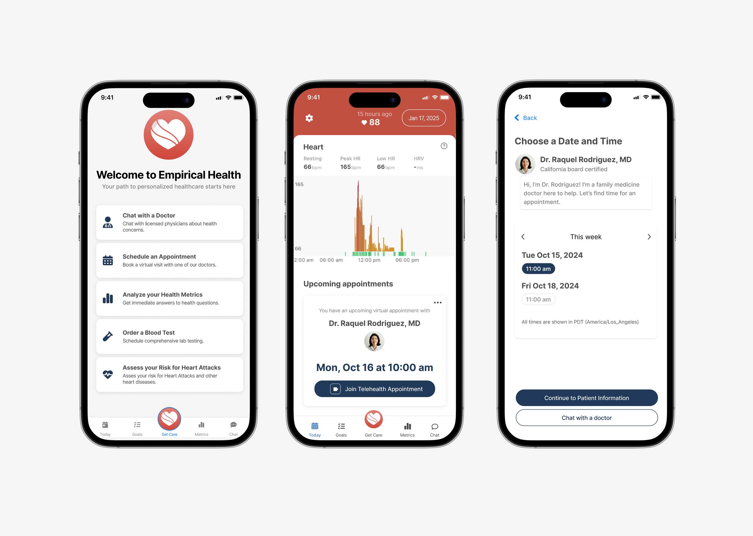
Empirical Health: Simplifying Appointment Booking

Empirical Health is a YCombinator-backed telehealth startup revolutionizing primary care by combining virtual doctor’s appointments with real-time wearable health data. Through the Empirical Health app, users can view detailed health metrics and book virtual primary care appointments, all in one place.
As a freelance project, I assessed the current mobile app UI and created recommendations to improve the doctors’ appointment booking flow.
Role
Sole Designer
Timeline
Dec 2024 - Jan 2025, 4 weeks
Tools
Figma
The Problem
Few users click on the doctor’s appointment booking flow. Of those who engage with the flow, many abandon it and 5/10 users no-show their appointments.
Ultimately, these metrics hurt Empirical Health, as booked appointments are a primary way the company generates revenue.
The Solution

Discovery
To assess the current user experience and identify areas for improvement, I conducted a heuristic evaluation of the booking flow by stepping through the experience myself.
Once a user presses the “Schedule a Video Visit” button, the flow consists of an introduction screen, a choose your location screen, a choose a date and time screen, and an input contact information screen.
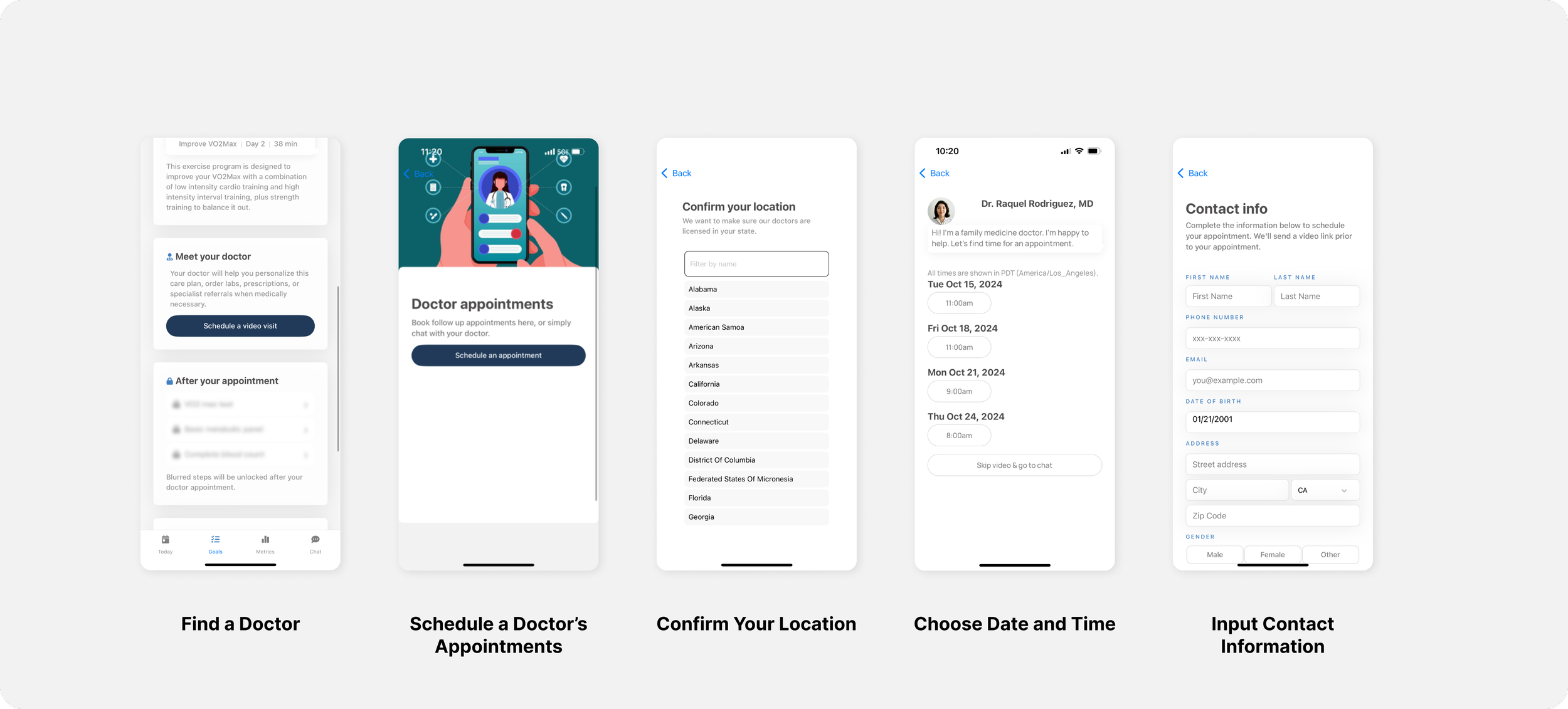
Current User Journey
The booking an appointment button isn’t discoverable all the time
Even though there are multiple ways to trigger a flow to book a doctor’s appointment, not all of them are easily discoverable.
Top 3 Findings


It’s hard to modify appointment details
The inflexibility of the flow may cause users to abandon the booking flow if they aren’t sure that they can change their appointment in the future.

Users could be forgetting about their upcoming appointments
Users may no-show because there are no in-app reminders that notify users of their upcoming appointments.
Informed by my heuristic evaluation findings, I decided to address solutions that would improve the discoverability and usability of the booking flow.
Designing Solutions
1.Addressing discoverability — Making the booking an appointment button visible
I explored several solutions to make the “Book an Appointment” button more accessible to users.
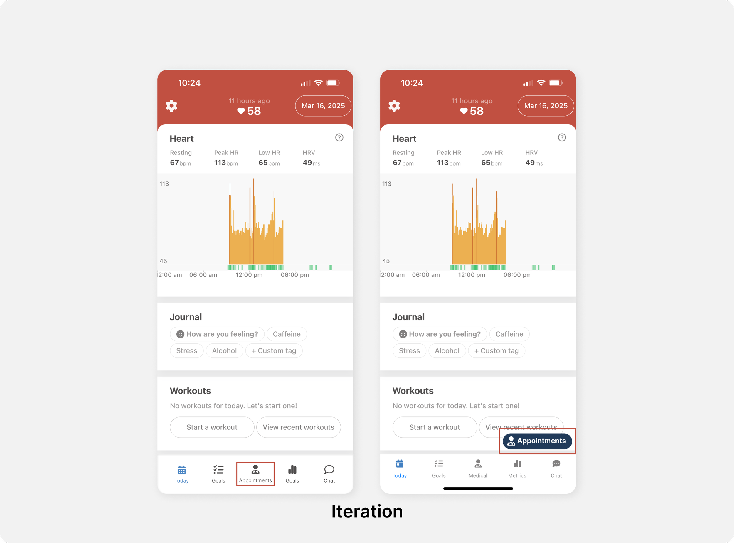
Ideating placement of the Appointments button to make the feature more discoverable.
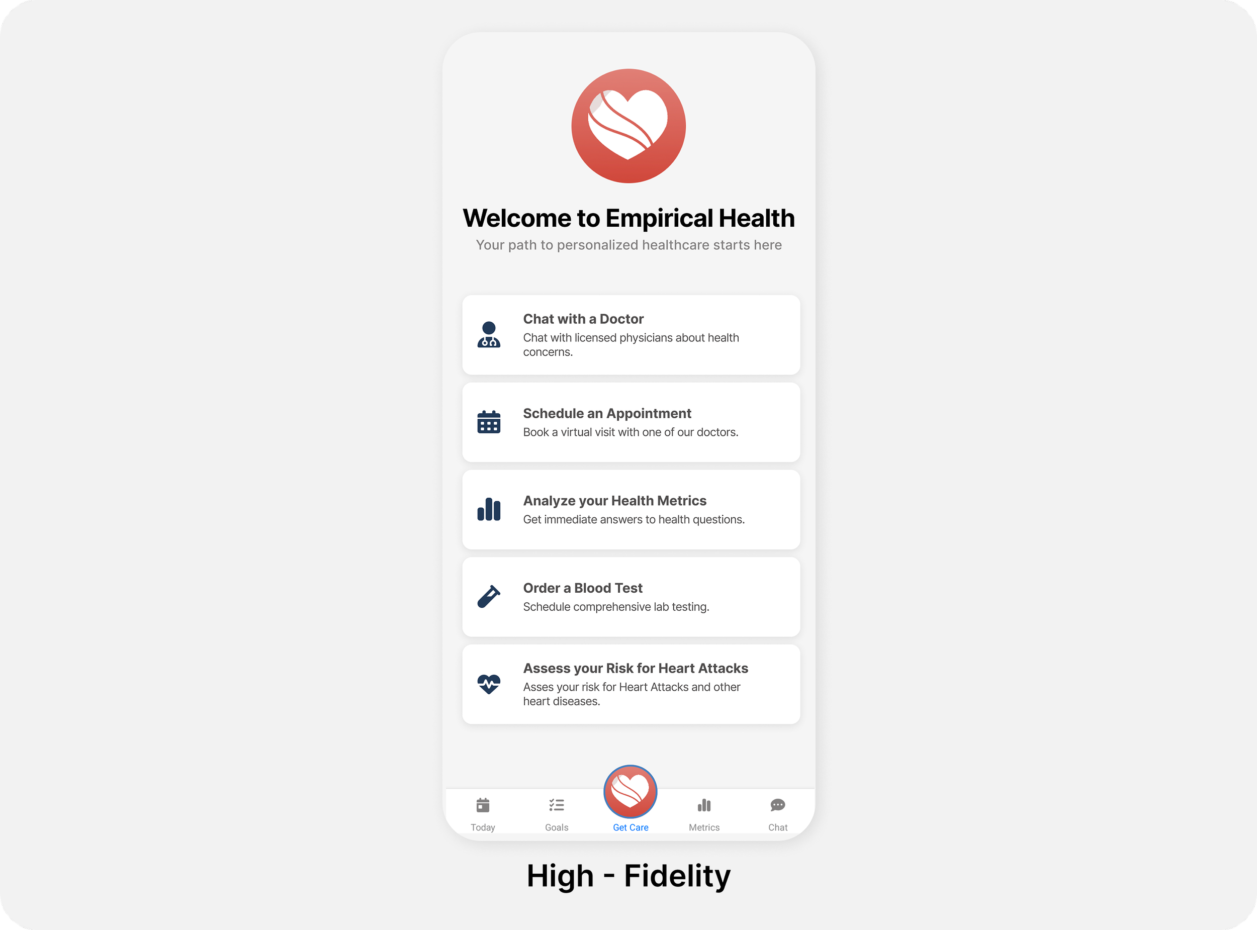
“Schedule an Appointment” appears within the menu under the “Get Care” button.
Pivot Upon discussing with engineering and PM stakeholders, we aligned on a “Get Care” button in the navigation bar that includes a function to schedule a doctor’s appointment. The central placement of the button in the navigation bar increases the feature’s discoverability, while advertising other features that the app offers.
2.Addressing Usability — Making the booking flow clear

I designed an optimized UX flow aimed at reducing user drop-off in the booking process.

Ideal User Journey
Revised user journey with Review and Book, Confirmation, and Appointment Reminder screens.
Design Considerations
In the current experience, I found it was difficult to modify appointment details. The inflexibility in the booking flow could lead to users to abandon the appointment booking flow altogether.
To improve the flow, I added review and cancellation options on a few key screens.
Designing for flexibility
Users have the ability to modify and cancel an appointment from the “Review and Book” screen and the appointment reminder cards on the Today page.
Designing for confirmation
In the current flow, users are not notified if they have successfully booked an appointment. The lack of confirmation may have caused some users to believe that they hadn't booked their appointment and therefore no-show.
I designed a confirmation screen that would clearly notify users that they had booked a doctor’s appointment.
A confirmation screen that shows users that their appointment is confirmed.
Designing to remind
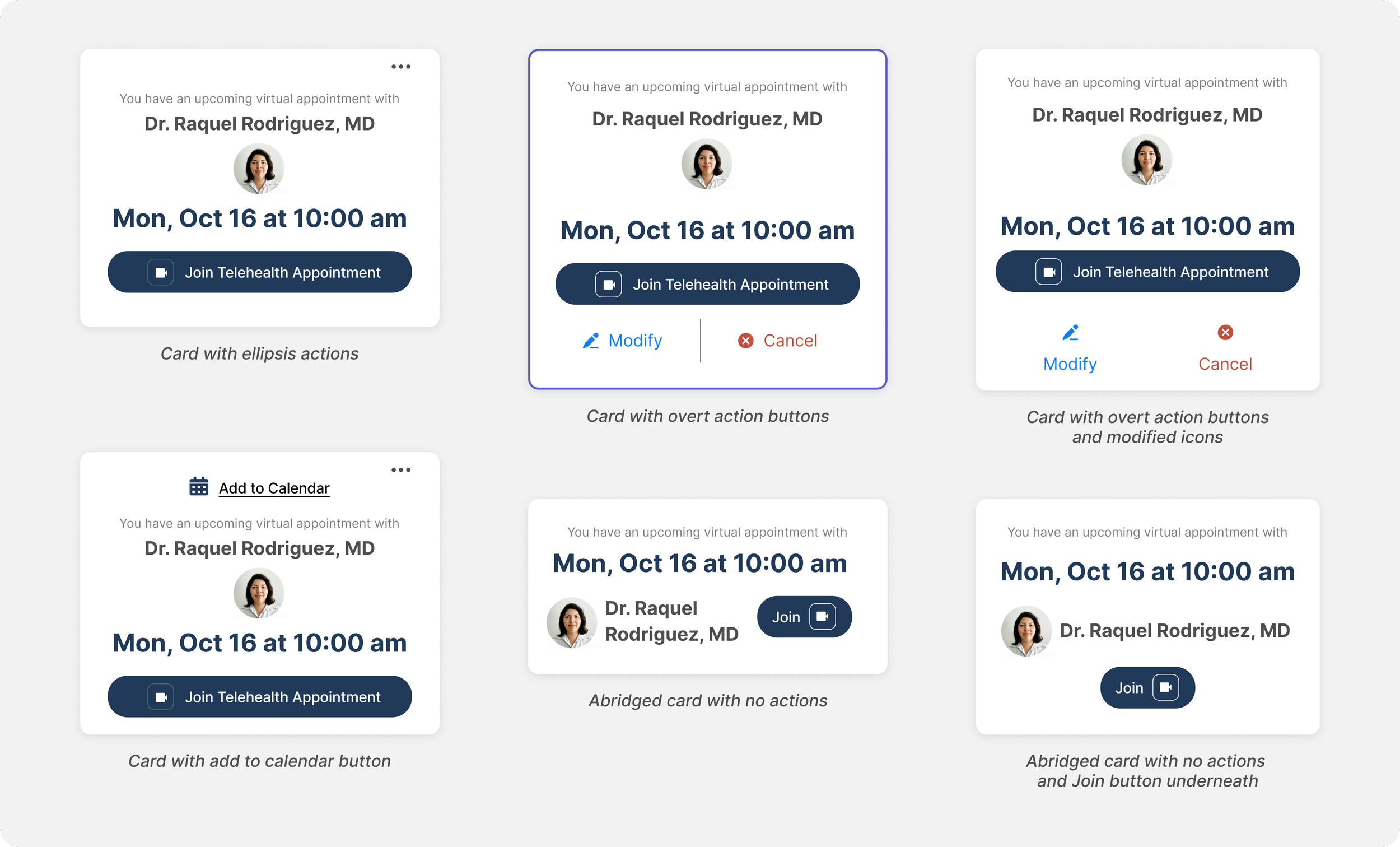
Reminder card iterations
Final Solution
For the final designs, I also included some other visual design and UI fixes that optimized for accessibility, readability, and improved hierarchy.
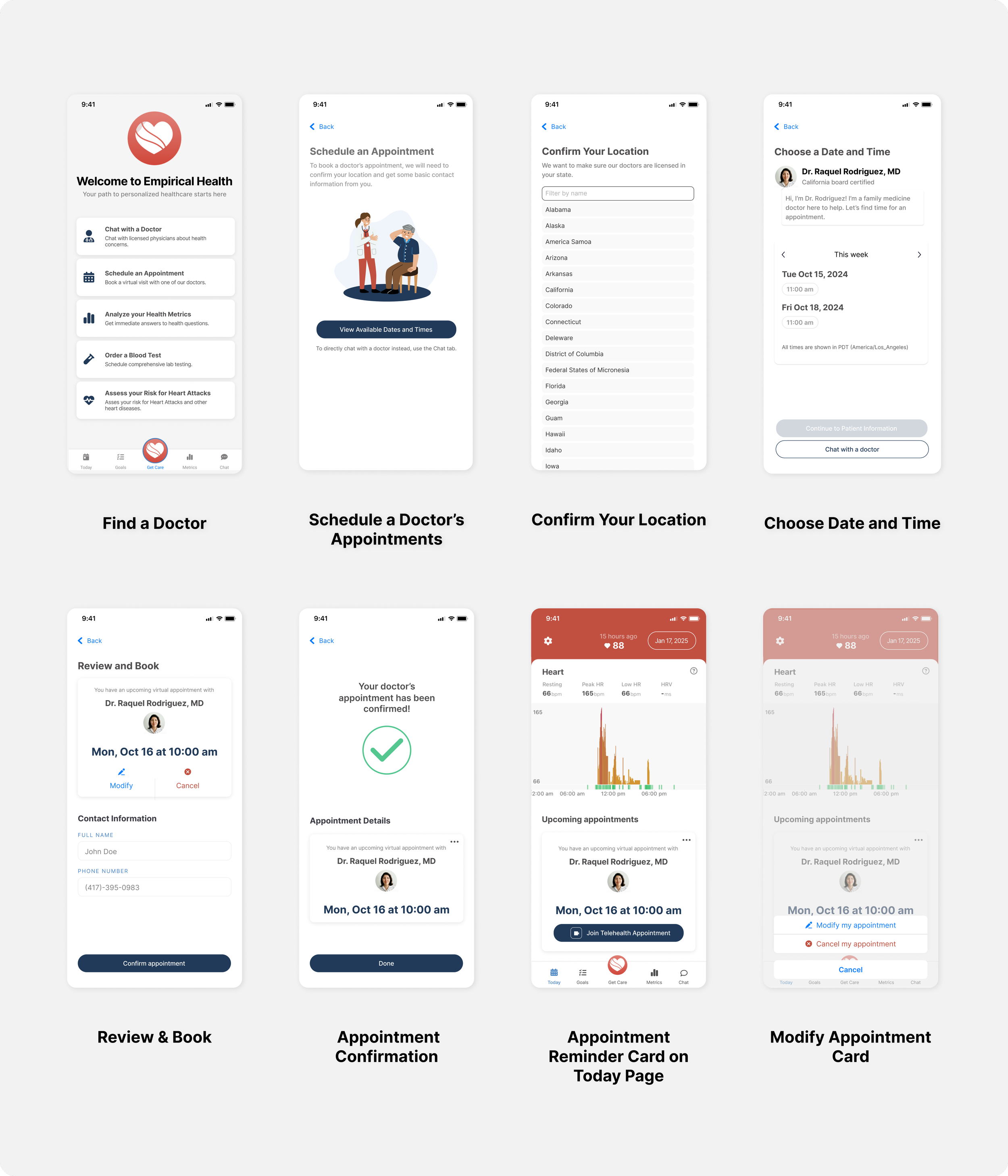
Final screen designs for revised doctor’s appointment booking flow
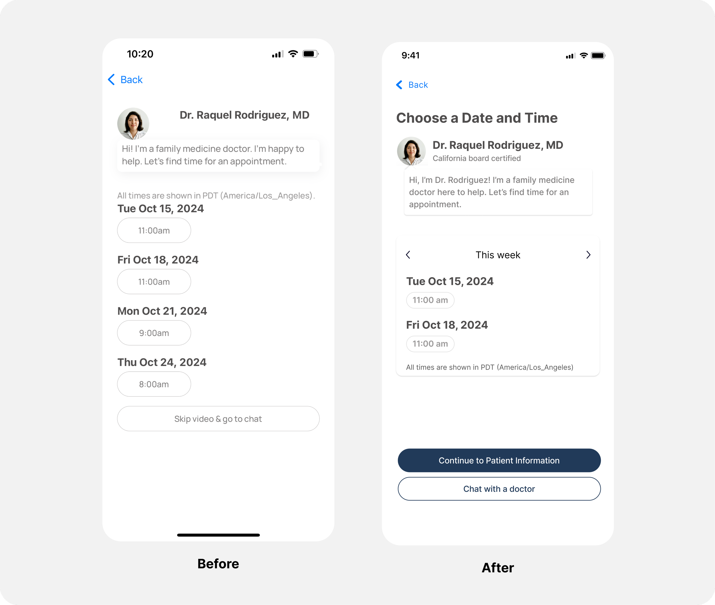
Before & Afters
Improved hierarchy on “Choose a date and time” screen.

Appointment reminder cards on the Today screen to remind users of upcoming appointments.
The Ask
Project Summary
I redesigned the doctor's appointment booking flow for a telehealth app to improve discoverability, reduce drop-offs, and decrease no-show rates.
I began by identifying key areas for improvement in the current app experience, focusing on discoverability and usability. To increase discoverability, I designed a “Get Care” button in the navigation bar where users can book doctor’s appointments. To address usability, I introduced flexible booking options, clear confirmation, and reminder notifications, ensuring a more user-friendly booking flow.
My Approach
Next Steps
Research could validate the increased discoverability and usability of the redesigned booking flow.
Research
Conduct a usability test on the redesigned appointment booking flow, gathering user reactions and feedback. Have participants walk through the scheduling process to identify pain points. Testing can include non-users, recruited via UserInterviews.com.
Conduct Usability Testing
Validate the top reasons why users no-show their appointment. Conduct a survey or implement an in-app feedback feature to ask users who miss their doctor's appointments about their reasons for cancellation.
Validate why users no-show
Impact
Additionally, several metrics can be tracked to measure the impact of the redesign.
Track the Click Rate of users who click the new “Get Care” button and subsequently press the “Book an Appointment” button to gauge the feature’s discoverability.
Measure Discoverability
Track the Click Rate users who successfully make it to the final “Confirmation” screen in the redesigned flow versus the last screen of the old booking flow. Compare the amount of no-show appointments between the old flow and new flow.
Measure Usability

A proposed timeline of how to conduct next steps research and measure impact.
Learnings
Animating Small Details
Motion design can elevate the user experience. To create a friendly and supportive experience, I played with subtle micro-interactions in the confirmation screen that created a delightful UI. I thought this small detail differentiated the app from other healthcare competitors.
Working within Constraints
Engineering constraints can sometimes lead to new ideas. Upon reviewing the feasibility of an “Appointments” button in the navigation bar, our ideas iterated into a “Get Care” button which provided added functionality and made several other features in the app more discoverable too.
Reframing Problems
There are multiple ways to think about the business problem. To address high cancellation rates, I addressed how the business could reduce no-shows to begin with by increasing the discoverability and usage of the booking flow.
